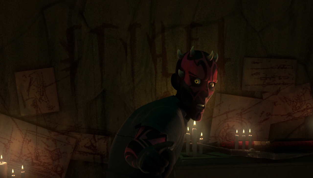
(The preview for this post shows this image disastrously large and cropped by the forum size, so i've also got it linked to the full-size image. Let me know if you're having problems seeing it !)
i'll search the episode slower if anyone would like me to check if there's a frame or 2 where each letter is fully visible.
in the old & new mando forum fonts for comparison:
- old: KENOBI
- new: KENOBI
Some things i've noticed:
- K on the wall has the triangular blade on the right side; the fonts lack this blade, instead featuring a curve crossing over the main stem.
- E on the wall doesn't have the triangle blade on the bottom, it tapers straight down. Both fonts feature the blade.
- N on the wall has an elongated triangle floating to the left; font N's triangle is small.
- O on the wall has a blade/triangle on the left side and tapers fully to a point; font O is straight and without tapering (old font is totally squared, new font has some angles but isn't tapered).
- B on the wall has a stronger serif at the upper right.
- I is... basically the same.
